
Bedroom styling
What Color Comforter Goes With Gray Walls?
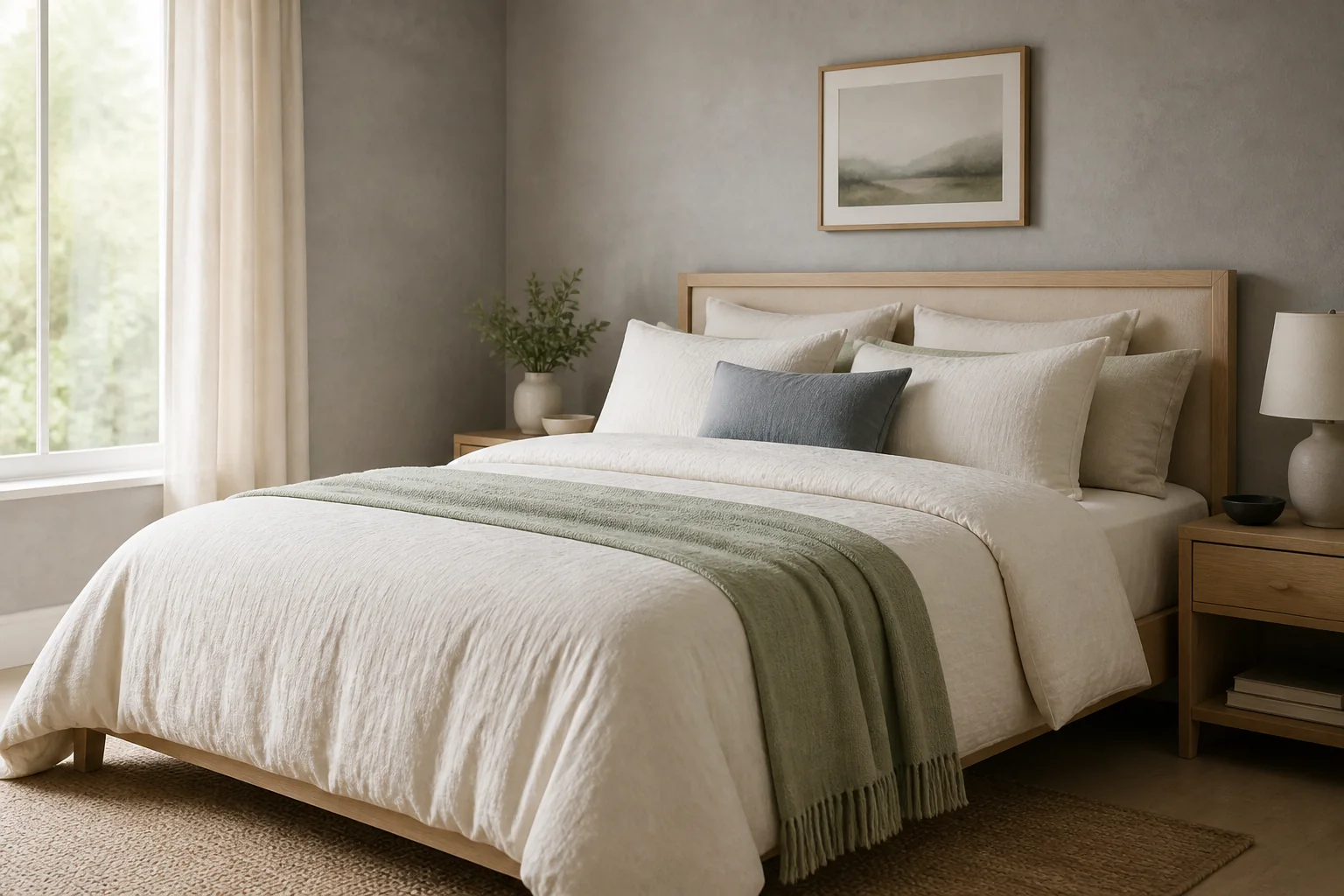
Start with the gray's undertone, then choose contrast: warm ivory, muted green, dusty blue, taupe and restrained terracotta are reliable options, but each creates a different room.
Disclosure: The Duvet Advisor is reader-supported. When you buy through links on our site we may earn an affiliate commission, at no extra cost to you. We only recommend products after comparing published expert research, verified specifications and clearly cited sources. How this works.
Quick take
For most gray bedrooms, warm ivory is the safest comforter color because it adds contrast without fighting either warm or cool undertones. Choose sage or dusty blue for quiet color, taupe or camel to warm a cool room, and deep navy or forest green when pale gray walls need stronger contrast. Judge fabric samples beside the wall in morning and evening light before buying; the same gray can look blue, green or brown as the light changes.
1. Identify whether the gray is warm or cool
Gray is not a single neutral. Benjamin Moore explains that gray paint can reveal blue, green, brown or other undertones, and that light and nearby decor can amplify them. Hold plain white paper beside the wall in daylight: a blue or green cast usually indicates a cooler gray, while beige, brown or violet warmth points to a warmer gray.
Do the check on more than one wall. North-facing light can emphasize blue and green undertones, while warm lamps may make the same paint look softer at night. A phone photo or a paint name is not reliable enough for the final decision because screens and room lighting shift color.
Use the undertone as a filter, not a rigid rule. Repeating it creates a calm palette; deliberately contrasting it makes the bed stand out. The practical goal is to make the relationship look intentional.
2. Choose one of five dependable comforter colors
Warm ivory or soft white is the most flexible choice. It separates the bed from medium or dark gray walls and prevents a cool-gray room from feeling flat. Choose creamy ivory beside warm greige; use a cleaner off-white beside blue-gray so the yellow cast does not become obvious.
Muted sage works especially well with warm gray or green-gray walls because it repeats the natural undertone without turning the room monochrome. Dusty blue creates a similarly quiet effect with cool gray. Keep both colors grayed-down rather than bright, then repeat the accent once in a cushion, artwork or throw.
Taupe, camel and restrained terracotta add warmth to blue-gray walls. Deep navy or forest green gives pale gray a stronger, tailored contrast. Charcoal can work too, but only when the room has enough light and the bedding includes a lighter sheet, pillow or throw to keep the bed legible.
- Safest all-rounder: warm ivory
- Soft natural color: muted sage
- Cool and calm: dusty blue
- Warm contrast: taupe, camel or restrained terracotta
- High contrast: navy or forest green
3. Match the choice to the actual room
Example one: light blue-gray walls, white trim and pale oak furniture. Use an ivory comforter, dusty-blue lumbar cushion and one sage throw. The ivory creates separation, while the two muted accents connect the cool wall to the warm wood without introducing a loud new palette.
Example two: medium warm-gray walls, walnut furniture and brass lighting. A sage comforter with ivory sheets repeats the earthy undertone; a small rust or camel cushion can connect the metal and wood. Avoid adding several equally strong accent colors.
Example three: dark charcoal walls in a room with limited daylight. Choose soft white or oatmeal bedding and keep the largest surface light. A dark comforter on dark walls can look sophisticated in a bright room, but in low light the edges disappear and the room can feel visually heavy.
4. Decide whether sheets should be lighter or darker
There is no rule that sheets must be lighter than the comforter. Lighter sheets give the top of the bed a clean outline and are the safer choice with dark bedding. Darker sheets create a cocooning look but expose lint and fading more readily and can reduce contrast when the wall and comforter are already deep in value.
Use a simple value sequence: wall, comforter and sheets should not all sit at the same lightness. With pale gray walls and a sage comforter, crisp ivory sheets make each layer readable. With charcoal walls and an ivory comforter, medium taupe sheets add depth without creating a stark black-and-white effect.
The Company Store recommends building from a limited palette and mixing solids and patterns at different scales. For a gray room, two main neutrals plus one accent is an easy ceiling: for example, gray wall, ivory bedding and sage accent.
Choose sleep performance before the shade
Use the comforter guide to narrow warmth, fill and construction, then select the best color among the suitable options.
Open the comforter guide5. Test fabric in the room before committing
Place the largest available fabric swatch flat on the bed, not against a store display. Check it in morning daylight, late afternoon and under the lamps used at bedtime. A tiny thread or online thumbnail cannot show how a Queen- or King-size field of color will affect the room.
Compare the swatch with the wall, headboard, floor and curtains. If it clashes, identify whether the problem is undertone or lightness. Changing from bright white to ivory fixes an undertone mismatch; changing from pale sage to forest green changes contrast.
If you like seasonal changes, keep the insert neutral and change a duvet cover instead of replacing a complete comforter. Confirm that cover and insert dimensions match and that the care routine suits the household before treating color as the only buying criterion.
Related: Best duvet cover materials
6. Avoid the three most common mistakes
First, do not match gray bedding to gray walls by name alone. Two products labeled gray may have opposing undertones, which makes the mismatch more noticeable than a clearly different color would be. If you want a tonal room, vary lightness substantially and repeat one undertone.
Second, do not select for appearance while ignoring warmth, fill, size and care. The Company Store's comforter guide treats those as separate buying decisions. Choose the correct sleeping performance first, then select among the available colors or use a removable cover.
Third, do not add every suggested accent. Sage, blue, camel and terracotta are alternatives, not a required set. One dominant comforter color, one neutral and one small accent usually reads more calmly than five competing colors.
Related: How to choose a comforter · Comforter size chart
7. Use this 60-second decision rule
If the gray undertone is unclear, start with warm ivory and add color through a washable throw or cushion. If the wall is distinctly cool, compare dusty blue for harmony and camel for contrast. If it is distinctly warm, compare sage for harmony and clean off-white for contrast.
For pale walls, medium or deep bedding can define the bed; for charcoal walls, light bedding is the lower-risk choice. Photograph the two finalists in the same light, then choose the one that still works when the accent cushions are removed.
This method is intentionally reversible. A room should not require repainting because a comforter looked different online. Sample first, keep the core palette limited and let sleep comfort outrank styling.
What helps
- Warm ivory works with most gray undertones
- Muted color adds personality without overpowering the room
- A duvet cover makes future palette changes easier
Tradeoffs
- Screen colors cannot predict the room accurately
- Gray-on-gray palettes expose undertone mismatches
- Dark bedding can visually shrink a low-light room
People also ask
What is the best color to go with grey walls?
Warm ivory is the safest all-round comforter color for gray walls. Sage and dusty blue create calm harmony, while camel, restrained terracotta, navy or forest green add stronger contrast. Check the wall's undertone and room light before deciding.
What color complements grey the most?
There is no single universal complement because gray may lean blue, green, violet or brown. Muted sage complements many warm and green-grays; dusty blue suits cool gray; warm ivory bridges most undertones without making the room busy.
Should your sheets be lighter or darker than your comforter?
Either can work, but lighter sheets create clean separation and are easiest with a dark comforter. Darker sheets feel more enveloping. Avoid making the wall, comforter and sheets nearly identical in lightness unless you deliberately add texture and contrast elsewhere.
How do you bring warmth to a grey room?
Add warm ivory, oatmeal, camel or restrained terracotta textiles, then repeat warm wood or brass in small amounts. Test the fabrics under the room's actual lamps because light changes how both gray paint and bedding read.
Sources and editorial method
We cross-check health context, textile definitions and practical guidance against authoritative sources. We do not present generated copy or published specifications as hands-on testing.