
Bedroom styling
What Color Sheets Go With a Beige Comforter?
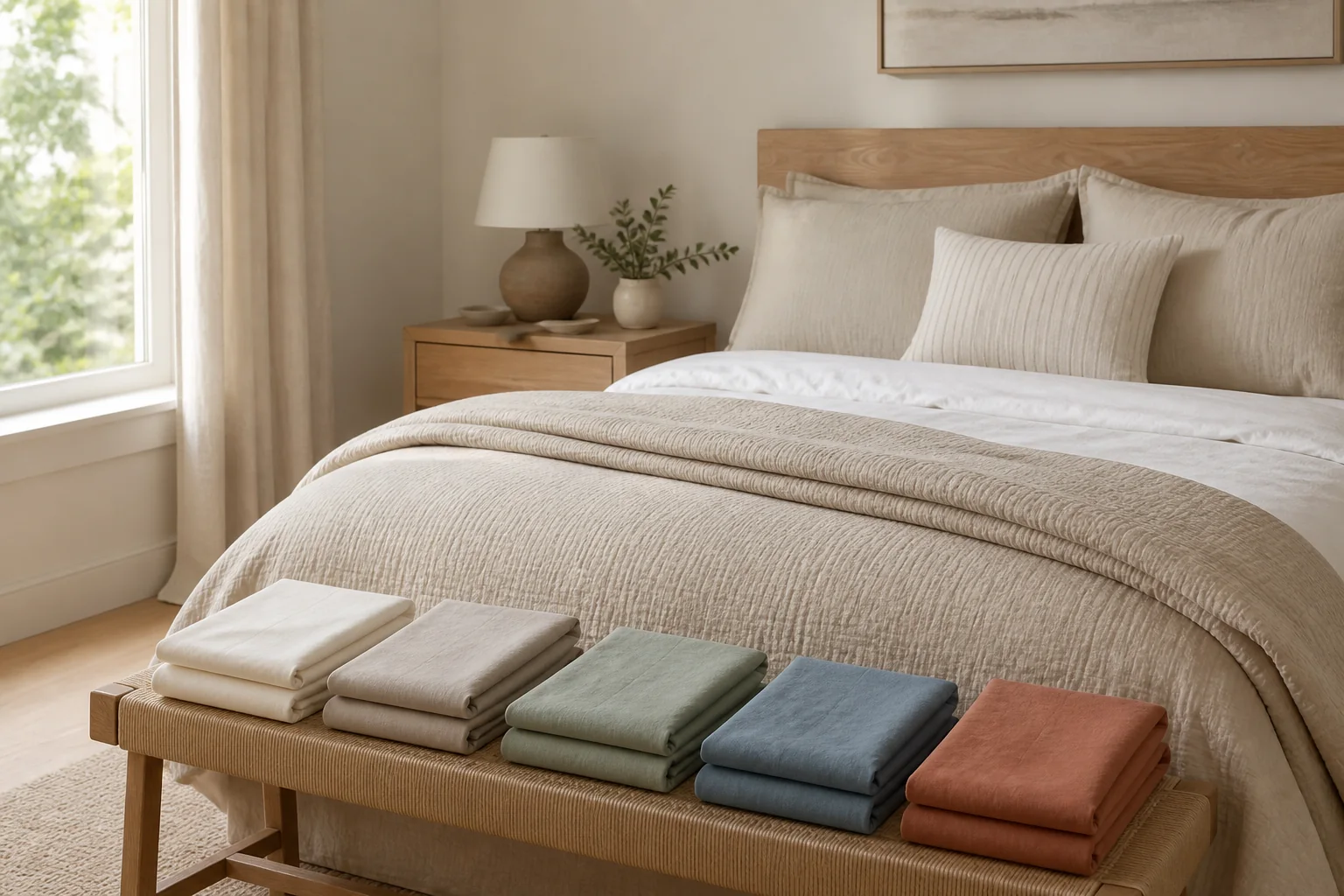
Warm white is the safest pairing, while oatmeal, taupe, muted sage, dusty blue and terracotta each solve a different contrast or undertone problem.
Disclosure: The Duvet Advisor is reader-supported. When you buy through links on our site we may earn an affiliate commission, at no extra cost to you. We only recommend products after comparing published expert research, verified specifications and clearly cited sources. How this works.
Quick take
Warm white is the lowest-risk sheet color for most beige comforters because it creates visible separation without making a warm beige look yellow. Use oatmeal for a soft tonal bed, taupe for deeper neutral definition, muted sage for an earthy accent, dusty blue to balance a warm room, or restrained terracotta when you want stronger warmth. First decide whether the comforter is warm beige, cool stone-beige or gray-beige, then compare real fabric at the pillow and folded edge in daylight and lamplight.
Who this guide is for—and its limits
This guide is for someone who already owns or has selected a beige comforter and wants sheets that make the bed look intentional. It addresses visible color relationships, not claims that beige or any suggested color improves sleep, health or mood.
Beige is not a standardized retail shade. It can mean yellow-tan, pink-beige, pale mushroom, cool stone, cream or gray-beige. Fabric texture, room light, screen settings and surrounding wood can shift the appearance further. Treat these combinations as a shortlist to compare with the actual textile.
Choose suitable dimensions, material, weave, temperature feel and care before color. A visually perfect flannel set is still wrong for a hot sleeper who wants crisp lightweight sheets. Styling should narrow practical products, not override comfort.
Related: How to choose a comforter
1. Decide whether the comforter is beige, cream or greige
Place plain white paper beside the comforter in indirect daylight. A yellow, peach or brown cast points to warm beige. A gray or slightly green cast suggests cool stone-beige. Beige with a strong gray component is commonly described as greige. Cream is usually lighter and more visibly yellow or ivory.
Sherwin-Williams describes beige as a transitional color that can read warm or cool depending on its surroundings, and its undertone guidance groups orange, yellow and red as warm and green, blue and purple as cool. Use those categories as observation tools, not rigid design laws.
Repeat the comparison under the lamps used at night. Warm bulbs can turn cream richer and make cool stone look dull; blue daylight can make warm beige appear grayer. The sheet pairing must work under the light in which the bed is normally seen.
2. Start with these six dependable sheet colors
Warm white is the safest all-round choice. It gives the folded sheet edge and pillows definition without the blue cast of an icy white. It works with warm beige, cream and many greige comforters, especially when the room has white trim.
Oatmeal produces a soft tonal bed. Choose a visibly lighter or darker oatmeal so it does not look like a failed dye match. Taupe adds deeper neutral definition; warm taupe suits tan beige, while mushroom taupe is often easier beside greige.
Muted sage creates an earthy accent without overpowering beige. Dusty blue balances a room already rich in warm wood, but compare it carefully beside yellow-beige. Restrained terracotta adds the strongest warmth and works best when repeated once in art, a cushion or a small rug rather than across every surface.
- Lowest-risk: warm white
- Soft tonal option: oatmeal
- Deeper neutral: taupe or mushroom
- Earthy accent: muted sage
- Cool counterpoint: dusty blue
- Warm contrast: restrained terracotta
3. Use a complete room example, not an isolated swatch
Example one: a warm tan-beige comforter, oak furniture, cream walls and warm lamps. Choose warm-white sheets for separation. Add muted sage only as one small accent so the room does not become a collection of competing earth tones.
Example two: a pale greige comforter, white walls, black metal bed and cool daylight. Use mushroom taupe sheets for a tonal result, or dusty blue for controlled color. An orange-beige sheet may expose the comforter's gray-green undertone and make the combination look accidental.
Example three: a light cream-beige comforter with walnut nightstands. Crisp warm white keeps the comforter visible; terracotta sheets make a stronger statement. If terracotta covers the full sleeping surface, keep pillows and throw simple rather than adding another bold color.
Example four: a medium beige comforter in a rental bedroom with gray carpet and cool-white walls. Dusty blue can connect to the cool room envelope, while oatmeal can bridge the gray and beige more quietly. Compare both beside the carpet, not just the comforter.
Related: Sheets for a gray comforter
Choose the sheet setup before finalizing color
Decide which sheet layers remain visible, then compare color only among materials and sizes that suit how you sleep.
Plan your sheet layers4. Should the sheets be lighter or darker?
Either direction works when the difference is deliberate. Lighter warm-white sheets create the clearest frame around medium or dark beige. They are especially useful when the wall and headboard are also beige because the bed needs one visible break.
Darker taupe, sage, dusty blue or terracotta sheets ground a pale comforter. Check whether the bed then merges with a dark floor or headboard, and consider that deeper colors can show lint, fading and light-colored pet hair more readily.
Use a simple value check: photograph the bed in grayscale or squint from the doorway. If comforter, sheet, headboard and wall collapse into one band, change sheet lightness before adding more accent colors.
5. Coordinate instead of chasing an exact beige match
Sheets do not need to match the comforter exactly. An intentional warm-white or sage pairing is often more coherent than two beige products whose yellow, pink, green or gray undertones conflict.
For a monochrome look, use value and texture to separate the layers. Pair a pale cream comforter with deeper oatmeal percale, or a medium greige comforter with lighter mushroom sateen. The Company Store recommends coordinating a limited palette and varying pattern scale and texture rather than making every layer identical.
Keep the bed to two main colors and one small accent. Beige comforter, warm-white sheets and one sage cushion is a finished palette. Adding dusty blue, terracotta, blush and charcoal at equal strength makes it harder to see the intended relationship.
6. Add pattern and texture without losing the neutral base
Solid sheets are the lowest-risk partner for a patterned or heavily quilted beige comforter. If the comforter is solid, a narrow ivory-and-taupe stripe, a small sage botanical or a restrained terracotta pinstripe can add interest.
Vary scale. The Company Store advises combining patterns at different sizes and grounding them with solids. A large botanical comforter needs a solid or very small sheet motif; a solid comforter can support the more visible print.
Texture behaves like another visual layer. Washed linen scatters light, crisp percale looks matte and sateen reflects highlights. Two fabrics carrying the same beige name can appear different because their surfaces handle light differently.
Related: Best duvet cover materials
7. Avoid the four common beige-pairing mistakes
First, do not assume all whites are neutral. A blue-white sheet can make a yellow-beige comforter look dingy. Compare soft white and bright white physically rather than relying on the product name.
Second, do not buy another beige by label alone. Sand, flax, natural, biscuit, stone, mushroom and oatmeal overlap across retailers. A clearly different warm white is safer than two near-matches from separate dye lots.
Third, avoid making every large surface beige at the same lightness. Beige wall, beige headboard, beige comforter and beige sheet can flatten the room. Introduce value contrast before adding decorative clutter.
Fourth, do not let styling override laundering. White can show soil sooner; deep colors can reveal lint and fading. Follow each item's label and choose a sheet you can maintain without an unrealistic routine.
Related: Do you need a top sheet?
8. Compare real fabric in the room
Request a swatch when available or use a seller with clear return terms. The Company Store's sheet-color guidance cautions that screen colors may not match the material in the room. Do not wash or open a set beyond the return conditions merely to compare color.
Place the sample behind the sleeping pillow and beneath the folded comforter edge. Check morning daylight, afternoon shadow and bedside lamps. Include wall, headboard, floor and curtains in the view.
Remove decorative cushions for the final decision. If the core sheet-and-comforter pair only works when several accents distract from it, the combination is weak. It should look deliberate with just the two large layers.
9. Use this quick decision rule
Choose warm white when uncertain. Choose oatmeal for a low-contrast natural bed, taupe for deeper neutral definition, muted sage for an earthy accent, dusty blue to balance a warm room, and terracotta when you want visible warmth.
Confirm that sheet and comforter differ enough in lightness, limit the bed to two main colors plus one accent, and compare real fabric in the room. Then recheck size, material, temperature feel and care.
If the beige reads unmistakably gray, use the gray-comforter method instead. If it reads pale yellow like cream, prioritize warm white and warm neutrals and be particularly cautious with icy white or blue-gray.
How we evaluated these pairings
We reviewed the current US search results, related queries and four genuine People Also Ask questions for sheet-to-beige-comforter styling. The live SERP was dominated by short visual and social results, leaving room for a practical undertone, value and sample-at-home method.
The pairing framework uses current bedding guidance from The Company Store, a dedicated cream-comforter guide from California Design Den, and undertone guidance from Sherwin-Williams and Benjamin Moore. We separated beige, cream and greige rather than treating every pale neutral as interchangeable.
The limitation is that color remains subjective and screen images are not calibrated samples. Dye lots, sheen, daylight and lamps change the result. We did not run a consumer survey or claim that any sheet color changes sleep outcomes.
What helps
- Warm white works across most beige undertones
- A limited palette makes future changes easier
- Sampling prevents screen-color mistakes
Tradeoffs
- Beige is not a standardized retail color
- Near-matching neutrals can expose undertone clashes
- Deep sheet colors may show lint or fading more readily
People also ask
Should sheets be lighter or darker than comforters?
Either works when the difference is intentional. Lighter warm-white sheets frame medium beige clearly; deeper taupe, sage, dusty blue or terracotta sheets can ground a pale beige comforter. Check the wall and headboard so all layers do not merge.
What goes with a beige comforter?
Warm white, oatmeal, taupe, muted sage, dusty blue and restrained terracotta are dependable options. Match the sheet's warm or cool undertone to the actual beige, then choose enough lightness contrast to keep the layers visible.
What colors don't go with beige?
No color is universally prohibited, but icy white can fight yellow-beige, orange-beige can clash with green-gray greige, and an almost-matching neutral can look accidental. Compare real fabric under the room's daylight and lamps.
Should your comforter match your sheets?
No. Coordinating undertone, lightness and texture is more reliable than finding an exact match. A deliberate warm-white-and-beige pairing often looks more coherent than two beige products from different brands or dye lots.
Sources and editorial method
We cross-check health context, textile definitions and practical guidance against authoritative sources. We do not present generated copy or published specifications as hands-on testing.