
Bedroom styling
What Color Sheets Go With a Sage Green Comforter?
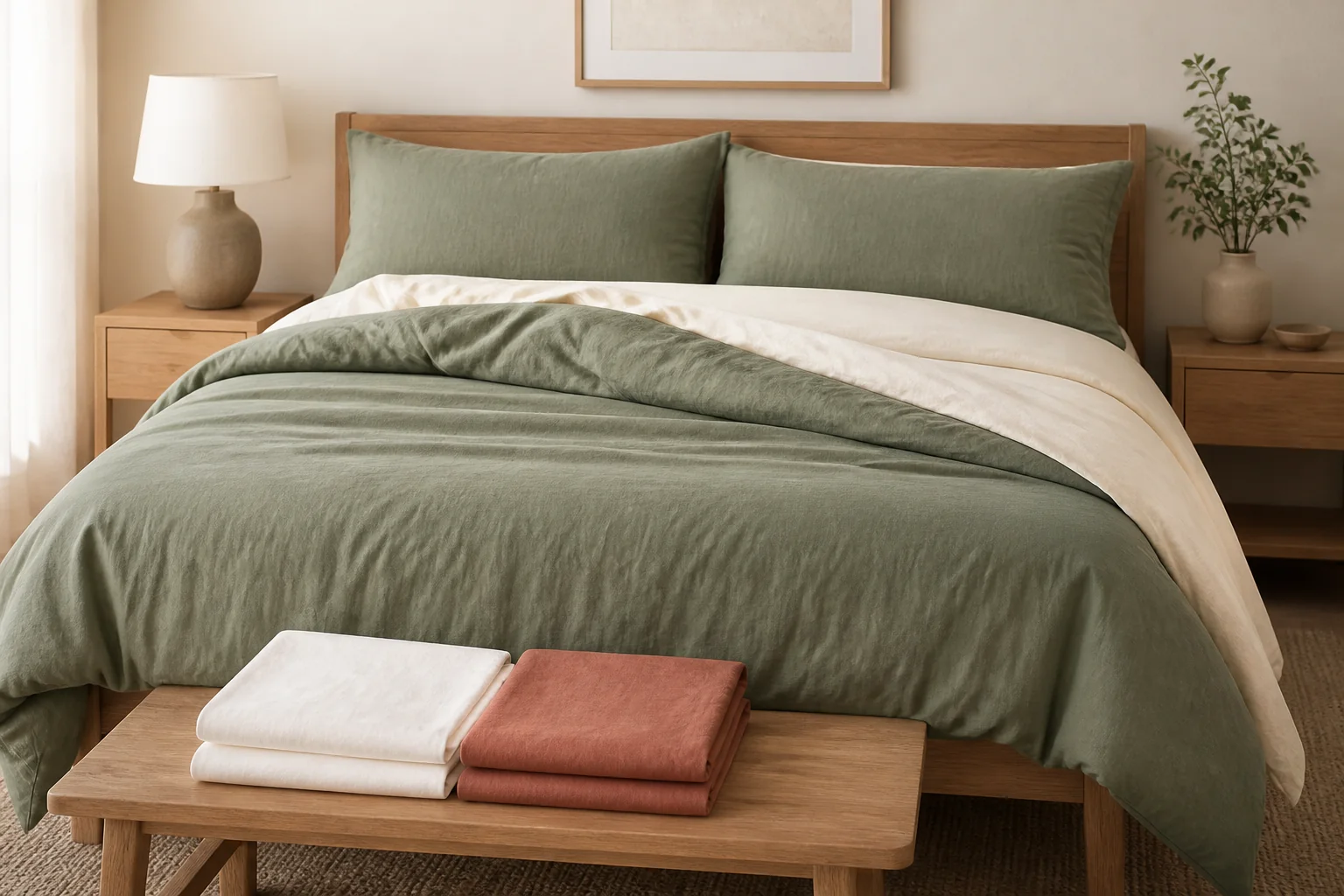
Warm ivory is the safest pairing, but soft white, oatmeal, taupe, dusty blue and restrained terracotta all work when their undertone and contrast suit the actual shade of sage.
Disclosure: The Duvet Advisor is reader-supported. When you buy through links on our site we may earn an affiliate commission, at no extra cost to you. We only recommend products after comparing published expert research, verified specifications and clearly cited sources. How this works.
Quick take
Choose warm ivory sheets for the lowest-risk match: they lighten sage green without creating the sharp contrast of bright white. Use oatmeal or warm taupe for a tonal, earthy bed; soft white for a cleaner look; dusty blue for a quiet cool palette; or muted terracotta for controlled warm contrast. Compare real fabric beside the comforter in morning and evening light, because online swatches and the word sage do not identify an exact undertone.
Who this guide is for—and its limits
This guide is for someone who already owns or has selected a sage green comforter and wants sheets that make the bed look intentional. It focuses on visible color relationships, not claims that one color improves sleep or mood for everyone.
Sage is a broad retail label. One comforter may lean gray, another yellow-olive and another blue-green. Fabric sheen, weave, room lighting and surrounding wood or paint also change how it reads. Treat the combinations below as shortlists to sample, not universal color rules.
Choose sheet material, temperature feel, size and care before color. A perfect-looking flannel sheet is still a poor choice for a hot sleeper who wants crisp, light bedding. Color should narrow suitable products, not override sleep comfort.
Related: How to choose a comforter
1. Identify which sage green you actually have
Place the comforter in daylight beside plain white paper. If the green looks gray and subdued, it is a neutral sage that accepts both warm and cool sheets. If it looks yellow or olive, warm ivory, oatmeal and clay tones usually form the more coherent shortlist. If it looks blue-green, compare soft white, pale gray-blue and cool taupe.
Repeat the check under the lamps used at night. Warm bulbs can make olive undertones stronger and turn a cool white sheet slightly creamy. North-facing daylight can make a gray-green comforter read cooler. The bed must work in the light you actually use, not only in a retailer image.
Also compare value—the relative lightness or darkness. A pale sage comforter needs either visibly lighter sheets or a deliberately deeper sheet to create separation. Two nearly identical muted tones can look like a failed match when their undertones differ by only a little.
2. Start with these six dependable sheet colors
Warm ivory is the safest all-round option. It gives sage a light neutral border and works particularly well with oak, walnut, rattan and other warm natural finishes. Choose an ivory that is creamy rather than distinctly yellow.
Soft white is cleaner and higher contrast. It suits cooler gray-sage and rooms with white trim, but an icy blue-white can make yellow-olive sage look dull. Oatmeal and warm taupe create a quieter tonal bed; make sure they are visibly lighter or darker than the comforter so the layers remain legible.
Dusty blue forms a low-saturation, cool pairing that works best with gray-sage. Muted terracotta or clay provides warm contrast and is more controlled than bright orange. The California Design Den guide similarly identifies ivory, taupe, beige and earth tones as useful sage pairings, while The Company Store recommends limiting a coordinated bedding palette to two or three main colors.
- Lowest-risk: warm ivory
- Clean contrast: soft white
- Earthy and tonal: oatmeal
- Deeper neutral: warm taupe
- Quiet cool color: dusty blue
- Warm accent: muted terracotta or clay
3. Use a complete room example, not an isolated swatch
Example one: a gray-sage comforter, pale oak bed, white walls and cool daylight. Use soft white sheets, then repeat the sage once in the shams. Add one dusty-blue cushion only if the room needs color; the bed already has two main hues.
Example two: an olive-sage comforter, walnut nightstands and warm lamps. Choose ivory or oatmeal sheets. A small clay lumbar cushion can connect the warm wood to the green without making red and green equal visual partners.
Example three: a pale sage comforter in a beige room. Avoid a near-identical pale beige sheet that makes every layer merge. Use deeper warm taupe sheets for definition, or crisp ivory sheets plus a textured oatmeal throw for a lighter result.
Example four: a dark sage comforter in a small room. Keep the large visible sheet surfaces light—ivory or soft white—and let the dark green be the anchor. Repeating another dark color across sheets, curtains and walls can make the whole room visually heavy unless that is deliberate.
Choose sheet feel before finalizing color
Compare material, weave, warmth and care first, then select the best color among the sheets that suit how you sleep.
Plan your sheet setup4. Decide whether sheets should be lighter or darker
Lighter sheets are the easiest choice because the folded top sheet and pillows create a clear frame around the comforter. They are especially useful with medium or dark sage. Ivory creates softer contrast; white creates stronger contrast.
Darker sheets can make a pale sage comforter feel more grounded. Warm taupe, charcoal-brown or deep olive can work, but check lint visibility, fading and whether the bed loses separation from a dark headboard. Dark does not automatically mean more sophisticated.
Use a three-step value check: take a grayscale phone photo of the bed, or simply squint at it from the doorway. If wall, comforter and sheets collapse into one band, change the sheet lightness before adding more accent colors.
5. Add pattern without making the bed busy
Solid sheets are the lowest-risk partner for a solid sage comforter. If you want pattern, choose one that repeats the sage or a neutral already in the room. A narrow ivory-and-sage stripe, a small botanical on a light ground or a restrained clay pinstripe can work without competing with the comforter.
The Company Store recommends mixing patterns at different scales and grounding them with solids. Apply that literally: if the comforter is a large botanical print, use solid sheets or a very small geometric. If the comforter is solid, the sheet can carry the smaller pattern.
Do not combine several unrelated prints simply because each contains green. Shared color helps, but scale and visual density still matter. Keep one large pattern, one small pattern and at least one solid resting area.
Related: Best duvet cover materials
6. Avoid the four common pairing mistakes
First, avoid buying by color name alone. Sage, moss, eucalyptus and olive overlap across retailers. Two products labeled sage can clash more visibly than sage and a clearly different ivory.
Second, avoid bright primary red as an equal partner unless a holiday palette is intentional. Green and red create strong contrast; muting the warm accent toward clay, rust or dusty rose makes it easier to control in a bedroom.
Third, do not force exact matching between sheets and comforter. Slightly different greens can expose their undertone mismatch. A deliberate neutral is usually easier than trying to find the identical green across different fabrics and dye lots.
Fourth, do not let style override laundering. White may show marks sooner but can fit some cleaning routines; dark saturated sheets may reveal lint or fade. Follow each item's label and buy the fabric and color you can realistically maintain.
Related: Do you need a top sheet?
7. Test the pairing before buying a full set
Request a fabric sample when available or buy from a seller with a clearly stated return policy. The Company Store warns that on-screen bedding colors may not match the material in the room and recommends checking a sample in home lighting.
Place the sample where the sheet will actually show: under the folded comforter edge and behind the pillow. Check morning daylight, afternoon shadow and bedside lamps. Compare it with the headboard, wall and floor as well as the green textile.
Remove decorative cushions during the final check. If the sheet and comforter only work when three accent colors distract from them, the core pairing is weak. A stable combination should still look intentional with just the two main layers.
8. Use this quick decision rule
Choose warm ivory when you are uncertain. Choose soft white for a cooler, cleaner room; oatmeal or taupe for a warm tonal room; dusty blue for quiet cool color; and muted terracotta when you want the sheets or folded top edge to create visible contrast.
Limit the final bed to two main colors plus one small accent. Repeat one color elsewhere—such as sage in the shams or clay in a cushion—but do not turn every room object into part of the bedding palette.
Then make the practical check: correct sheet size, suitable weave, comfortable temperature feel and label-compatible care. The best-looking pairing is the one that remains comfortable and maintainable after the styling photo is over.
How we evaluated these color pairings
We reviewed the live US search results and genuine People Also Ask questions for the sheet-to-sage-comforter decision. We compared the recurring neutral, tonal and contrast approaches with current bedding guidance from The Company Store and a dedicated green-comforter guide from California Design Den.
Our information-gain approach is to separate undertone, lightness, pattern scale and room lighting rather than declaring one fashionable color universally best. We provide concrete room examples and a reversible sample-at-home test instead of invented survey data or claims about psychological outcomes.
The limitation is that color judgment remains subjective and product images are not calibrated samples. Dye lots, screen settings, fabric texture and light can change the result, so the final recommendation must be confirmed with the actual comforter and candidate sheet fabric.
What helps
- Ivory works with most sage undertones
- A limited palette makes future layer changes easier
- Sampling prevents expensive screen-color mistakes
Tradeoffs
- Sage is not a standardized retail color
- Tonal greens can expose undertone mismatches
- Very dark sheets may show lint or fading more readily
People also ask
What color bedding complements sage green?
Warm ivory, soft white, oatmeal, warm taupe, dusty blue and muted terracotta all complement sage green in different ways. Match warm or cool undertones, then use sheet lightness to create enough separation from the comforter.
Should sheets be lighter or darker than comforters?
Either can work. Lighter ivory or white sheets create the clearest frame around medium or dark sage. Deeper taupe or olive sheets can ground a pale sage comforter, provided the wall and headboard do not make every layer merge.
What color complements sage green the most?
Warm ivory is the most flexible low-risk partner. Muted terracotta creates stronger warm contrast, while dusty blue creates a quieter cool palette. The best choice depends on the sage undertone, room light and surrounding finishes.
What colors do not go with sage green?
No color is universally forbidden, but icy white can fight yellow-olive sage, nearly matching greens can reveal undertone differences, and bright primary red can dominate the room. Test muted alternatives beside the actual comforter before buying.
Sources and editorial method
We cross-check health context, textile definitions and practical guidance against authoritative sources. We do not present generated copy or published specifications as hands-on testing.