
Bedroom styling
What Color Sheets Go With a Blue Comforter?
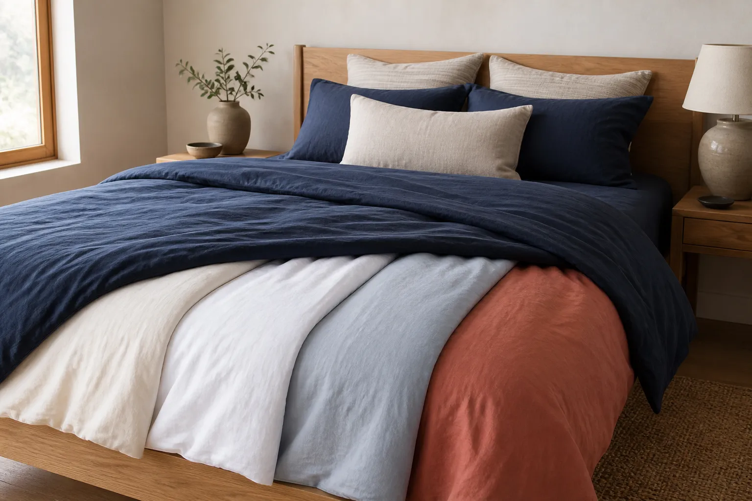
Warm ivory is the safest match, while white, blue-gray, oatmeal and muted terracotta create different levels of contrast around navy, denim and pale-blue comforters.
Disclosure: The Duvet Advisor is reader-supported. When you buy through links on our site we may earn an affiliate commission, at no extra cost to you. We only recommend products after comparing published expert research, verified specifications and clearly cited sources. How this works.
Quick take
Choose warm ivory for the lowest-risk pairing with most blue comforters. Crisp or soft white gives navy a clean frame; pale blue-gray creates a quiet tonal bed; oatmeal warms cool denim blue; and muted terracotta adds controlled complementary contrast. First identify whether the comforter leans green, violet or gray, then compare real fabric beside it in daylight and lamplight. Color is the final filter after sheet size, feel, temperature and care.
Who this guide is for—and what color cannot solve
This guide is for someone who already owns or has chosen a blue comforter and wants a sheet color that makes the bed look deliberate. It covers navy, denim, slate, cobalt and pale blue rather than pretending that blue is one standardized retail shade.
The recommendation is visual, not medical. A color does not make sheets cooler, cleaner or better for sleep. Choose the correct size, material, weave and care routine first; then use color to decide among sheet sets that already fit those practical requirements.
Screen images are an unreliable final check. Dye lot, fabric sheen, warm bulbs, north-facing daylight and nearby wall color can all change how the same blue appears. Use the combinations below as a shortlist to test with the actual textile.
Related: Do you need a top sheet?
1. Identify the blue before choosing a sheet
Place the comforter beside plain white paper in indirect daylight. A green-leaning teal or peacock blue usually works with warmer ivory, sand and muted clay. Violet-leaning navy can pair cleanly with white, cool gray or dusty lavender. Gray-blue and denim are flexible but can look flat beside another near-identical gray tone.
Next compare lightness. A dark navy comforter benefits from a clearly lighter sheet because the folded top edge and pillows frame the heavy top layer. A pale powder-blue comforter can use white for an airy look or a deeper slate-blue sheet for intentional contrast.
Repeat the comparison under the bedside lamps. Warm bulbs can soften white into cream and make blue appear slightly greener; cool LEDs can make a creamy ivory look yellow. The relevant color is the one you see in the room at the time you use it.
2. Start with five dependable sheet colors
Warm ivory is the lowest-risk all-round choice. It lightens navy and denim without the sharp edge of optic white, and it connects blue bedding to oak, walnut, rattan and beige walls. Choose a restrained cream rather than a strongly yellow ivory.
White creates the cleanest contrast and is especially effective with navy or saturated cobalt. Pale blue-gray creates a calm tonal palette; keep it visibly lighter than a dark comforter or visibly darker than a pale one. Oatmeal adds warmth to cool blue, while muted terracotta provides a small complementary accent without turning the bed into equal blocks of blue and orange.
These choices follow two useful principles: Sherwin-Williams identifies blue and orange as complements that create strong contrast, while The Company Store recommends limiting coordinated bedding to two or three main colors and using neutrals to separate bolder patterns.
- Safest neutral: warm ivory
- Cleanest contrast: soft or crisp white
- Quiet tonal option: pale blue-gray
- Warm natural option: oatmeal
- Controlled complementary accent: muted terracotta
4. Adjust the formula for denim, slate and pale blue
A denim-blue comforter is often medium in value and slightly muted. Warm ivory gives it a relaxed, familiar frame; oatmeal makes the bed more rustic; and white makes it cleaner. Avoid a second denim shade that is almost—but not exactly—the same, because the mismatch can look accidental.
A gray-blue or slate comforter can take soft white, ivory or a deeper navy sheet. If the walls are also gray, introduce a warmer neutral so the entire room does not collapse into cool midtones. An oatmeal fitted sheet and ivory pillowcases can provide warmth without introducing a loud accent.
A pale powder-blue comforter needs definition. White produces a light, low-contrast bed, while slate-blue sheets create a clear border. In a small room, keep most large surfaces light and use the deeper blue only where the fitted sheet or folded top sheet remains visible.
Related: Sheet colors for a gray comforter
5. Mix patterns by scale, not by guesswork
Solid sheets are the safest partner for a patterned blue comforter. If the comforter has a large floral, medallion or wide stripe, choose a solid sheet in one repeated color or a very small geometric. If the comforter is solid, the sheets can carry the smaller pattern.
The Company Store recommends varying pattern scale, repeating at least one color across layers and grounding the arrangement with solids. Apply that as a three-layer rule: one dominant pattern, one small supporting pattern and one solid resting area.
For example, pair a solid navy comforter with an ivory sheet printed in a thin blue pinstripe. Or pair a navy-and-white botanical comforter with plain white sheets and a textured oatmeal throw. Do not add a large orange floral simply because orange complements blue; color harmony does not erase competing scale.
6. Should sheets be lighter or darker than the comforter?
Lighter sheets are the most reliable choice with medium and dark blue comforters. They outline the comforter, brighten the pillow area and keep a dark headboard from swallowing the bedding. Ivory makes that transition soft; white makes it crisp.
Darker sheets work best under a pale comforter. Navy beneath powder blue can make the top layer look intentional, but it may also show lint and fading more readily. Check the care label and laundering routine before choosing a saturated dark sheet solely for appearance.
Use a grayscale phone photo as a quick value test. If walls, headboard, comforter and sheets merge into one gray band, change sheet lightness before buying more decorative pillows. A bed can be monochromatic while still having clear light-dark structure.
7. Avoid these common blue-bedding mistakes
Do not buy by shade name alone. Navy, midnight, marine and indigo overlap across sellers. Request a sample when available or compare a returnable pillowcase before committing to a full set.
Do not force an exact blue match across different fabrics. A matte cotton comforter and glossy sateen sheet reflect light differently, so even the same dye reference can read as two colors. A deliberate ivory or white pairing is often more coherent than a near-match.
Do not use every available accent. Blue comforter, orange sheets, yellow throw, green cushions and red artwork may each make sense separately, but the bed loses hierarchy. Keep two main colors and one smaller accent.
Finally, do not let styling override maintenance. White may show marks sooner, dark navy may reveal lint or fade, and a delicate fabric may not suit the household. Choose a color and material you can care for according to its label.
Related: How often to wash a duvet cover
8. Run a ten-minute sample test in the actual room
Place the candidate fabric where sheets will show: behind the pillow, below the folded comforter edge and beside the headboard. Check it in morning daylight, afternoon shadow and bedside light. The Company Store specifically notes that on-screen bedding colors may differ from the material in a home and recommends checking fabric samples where possible.
Remove decorative cushions while judging the pair. If the comforter and sheet only look coordinated when several accents distract from them, the core combination is weak. The two main textiles should still look intentional alone.
Then photograph the bed from the doorway and close up. The distant view reveals overall contrast; the close view reveals undertone and texture. Keep the sample that works in both views, then confirm size, return terms and wash instructions before ordering the full set.
How we evaluated these pairings
We used current US DataForSEO volume, intent, organic competitors, related searches and four verbatim People Also Ask questions for this exact blue-comforter decision. The SERP shows a separate visual intent built around navy, white, cream and room-palette examples rather than a generic sheet-buying query.
We cross-checked the recommendations against current color-wheel guidance from Sherwin-Williams and bedding-specific pattern and color guidance from The Company Store. We did not treat retailer swatches, trends or generated images as calibrated evidence.
Our information-gain approach separates undertone, value, pattern scale and room lighting, then gives reversible examples and a sample-at-home test. Color remains subjective, so the final decision belongs to the actual fabric in the actual room.
What helps
- Ivory and white are easy to reuse with future bedding
- Value contrast makes the layers readable
- Sampling prevents screen-color surprises
Tradeoffs
- Blue shade names are not standardized
- Near-matching blues can expose undertone differences
- Dark saturated sheets may show lint or fading
People also ask
Should sheets be lighter or darker than comforters?
Lighter ivory or white sheets are the easiest choice with medium or dark blue comforters because they create a clear frame. Darker navy or slate sheets can ground a pale blue comforter when there is enough contrast from the headboard and walls.
What goes with a blue comforter?
Warm ivory, soft white, pale blue-gray, oatmeal and muted terracotta all work for different effects. Match the blue's undertone and choose a sheet lightness that remains visibly separate from the comforter.
What colors complement blue bedding?
Orange is blue's direct color-wheel complement, but muted terracotta is easier to control in a bedroom. Ivory, white and oatmeal are flexible neutrals, while blue-gray creates a quieter tonal palette.
What color bed sheets complement a navy blue comforter?
Warm ivory is the safest all-round choice. White gives navy crisp contrast, oatmeal warms it, pale blue-gray creates a tonal look and a small muted-terracotta accent provides stronger contrast.
Sources and editorial method
We cross-check health context, textile definitions and practical guidance against authoritative sources. We do not present generated copy or published specifications as hands-on testing.